Reasons to dislike where I live
Besides the snow, cold rains, distance from the mountains, distance from the ocean, and weird roads, there isn’t much I regret about moving to Edmonton all those years ago. But one of the reasons I chose Edmonton over, say, Calgary was the arts and culture scene. And over the years big oil in C-town and a general malaise in the E-town scene has slowly eroded the benefit of Edmonton over other locales.
Be that as it may, it is always so tempting to play the grass is greener game when you read about art etc. in the big big-cities. I mean why don’t we have an exhibit of 16th-19th century cat art? Huh! Why!
This is so awesome! The Japanese Society gallery in NYC (333 East 47th Street New York, NY) is hosting the following exhibit of woodblock prints this spring:
LIFE OF CATS: SELECTIONS FROM THE HIRAKI UKIYO-E COLLECTION
Fri, Mar 13 – Sun, Jun 7, 2015
Since arriving in Japan aboard Japanese ships transporting sacred Buddhist scriptures from China in the mid-sixth century, cats have proceeded to purr and paw their way into the heart of Japanese life, folklore, and art. Life of Cats: Selections from the Hiraki Ukiyo-e Collection illustrates the depth of this mutual attraction by mining the wealth of bravura depictions of cats to be found in ukiyo-e woodblock prints of the Edo Period (1615-1867).
You can see how this would be cause for jealousy in any lover of art/cats/woodblock printing.

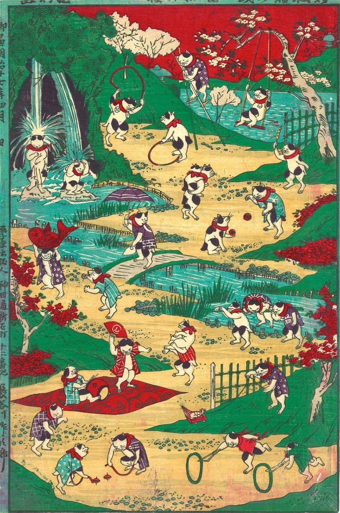
Be sure to visit the Gallery site and flip through the whimsical and amusing prints; you just won’t have that many chances in life to empathize with a 19th century Japanese dude like this.

Nothing to say.
So have a picture!
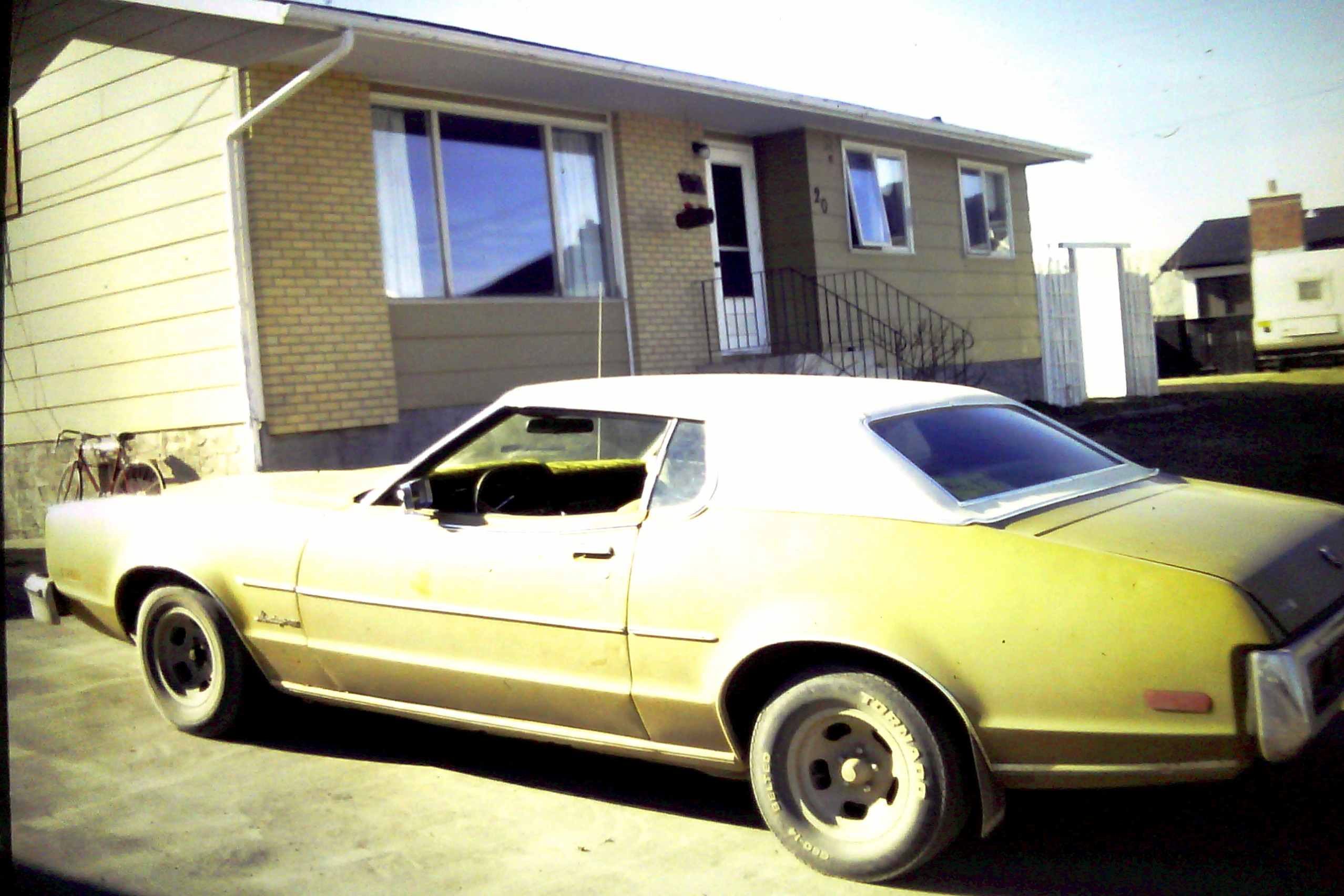
1973 Mercury Montego MX Brougham; a 400 Ford 2bbl, slotted magnesium rims with 60 wides on the front and 50 wides on the rear. Diamond tufted, crushed velvet interior, chrome and wood steering wheel, and fairly decent Pioneer stereo.
My first car.
What do I look like?
I caught a glimpse of myself in the bathroom mirror the other day and liked my hair. Now before you go thinking I was all vain and stuff, those of you acquainted with me long-term know I generally get my hair cut once, maybe twice, a year. During that time there are 4 or 5 points (lengths really) that I usually say to myself, “Hmmmmm, I like that look, I should remember it.” So since it was one of those moments and I had my cellphone in hand, I thought Why not a selfie for posterity and to show my stylist next time I get a cut. Simple right?
So here’s the deal. It turns out that the fact that your eyes only point one direction and maintain a constant relationship with your mirror self means that your everyday ‘self-view’ as seen in the mirror isn’t at all related to how you actually look. How do I know this? Because I took like 30 pictures from a million angles and none of them look like me. None. They are all pictures of some other guy with bad hair. In the end I could only assume that the only way the picture would turn out the way it actually was (i.e. the way I saw it), was if I held the camera right in front of my face, lining up the lens exactly with my eyes and using the obviously correct pov. So I did. Life is weird.

I don’t look like this
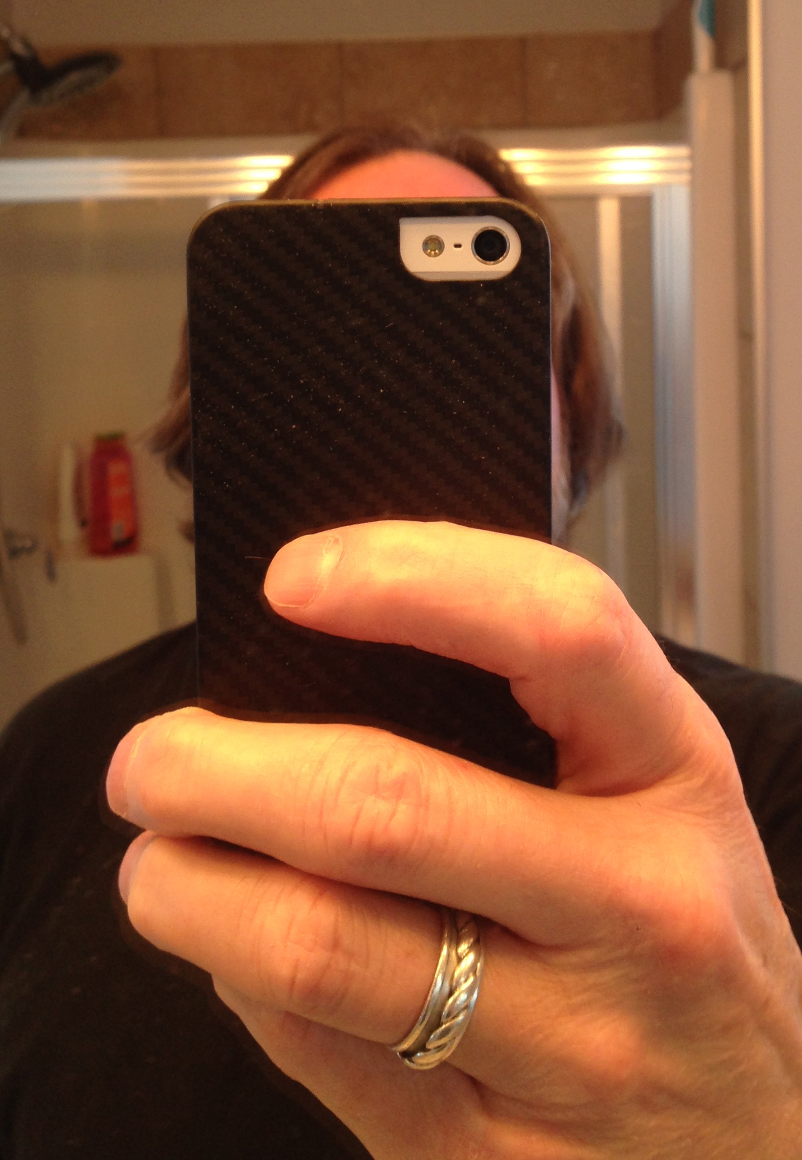
This is what I look like
Windy World
It’s said if you want to sail fromMexico back to to BC it’s easier to go to Hawaii and then swing back east. On the face of it this seems ridiculous, but the winds and currents are one of those absolutes we landlubbers often fail to appreciate. The advent of satellite imagery, open data and of course Google have made the resources available online a great way to visual the issues involved.
Visit the site to play with the maps.
It’s easy to see from this, that if one wishes to go north up the Baja Peninsula and the coast of California you will be head into the the wind the whole time. That means motoring the whole way and bashing into the waves. Better, and probably more comfortable, to sail west on a beam reach and then swing back; all you need is to be comfortable with being 1000 miles off shore. No biggee.
And then take a look at the Atlantic: easy to see why Columbus ended up in the Caribbean rather than New York 🙂
Sale Ho!

“So we are looking at $12K all in?”
“Uh, ya. Twelve thousand and the fees.”
“The fees?”
“Ya. Umm, the fees.”
“What fees?”
“Umm… the fees.”
“And they are…”
“Uh, well see… Ummm, there’s these fees, you know, for the docks and the paper transfers and the guys. You know.”
“Ok. I agree after the papers are signed I have to pay the marina to keep her here. And the Registrar will charge its usual tithe for the title transfer. But those are my costs and not part of the transaction right?”
“Uh. Ya. I guess.”
“So… the guys?”
“Oh. Ya. The… ummm… guys… um… well…you know…”
“No. Obviously I do not, as you put it…’know’.”
“Ya.”
The silence that followed took the whole conversation full circle from weird, to confusing to ominous and finally back to just weird. I waited patiently as long as I could, eyeing the scrawny, scruffy almost-man that had yet to discover a good use for his razor, but eventually it was just too much.
“The guys…?” I reminded him. “They have names? Or a job description perhaps?”
His sallow eyes lit up at this last and hope flared for a moment. “Ya. The gu… The tax collecters. That’s them. The Tax Collectors. They’s gonna wanna talk to you after is all. You can talk to them direct-like. Ya.”
“Ya.”
Huh.
What kind of Designer am I?
One of the things about doing a small magazine is that you do a lot of ads. One of the things about doing ads for a small magazine is your turnaround time is short. Very short. In the old days I might fuss over an ad for weeks and certainly the “idea” of an ad campaign was generally worked on over a season and each ad was thus just a variation that you played with for a week or so.
These days Rob usually sends me a size and a client name and asks me to make something up (see my Toast Post). If I am lucky he has included some body copy. If I am really lucky he has included some graphics (although 50% of the time they are too small or too ugly to be of any use) and if I am extremely lucky I get an ad or brochure to use as a base. Then he usually wants to see it the next day. Sometimes the same day. It’s a whole different kettle of fish. And, rather than getting feedback on the various options I try to supply, I usually get a few text changes or the infamous “Can you add a few Xmas ornaments or tinsel without making it look tacky?”, but mostly they just pick one and deliver an “approved.” And once it’s approved, fussing or changing anything beyond a bit of kerning is deeply frowned upon.
To get going, most companies have websites or Facebook pages and you can start there, looking for inspiration or at least a logo. Sometimes you resort to competitor’s ads to see what the genre looks like. And there is always the photo stock agency to mine for pictures, but that can get problematic if you don’t actually know what the companies product or brand is—and I don’t. It’s easiest to dump a bunch of stuff on the pasteboard and see what it looks like organically. One of my biggest challenges is always colour. If I have a good palette to start from then things generally flow ok. If I don’t, then I can run into some big problems that have me gritting my teeth later because with the short timelines switching boats midstream doesn’t happen. Take these two ads for the same client for example. I hate the first one and want nothing more than to start over. The second one works for a whole lot of reasons and is starting to become one of my favourites from this issue (which, btw, is off to the press as we speak).

Nevada Place came first. I had a brochure to steal copy and images from but it was a dark, dark blue with yellow headlines that wouldn’t work in a smaller format with all the other junk. So I visited Aryes and Oxford’s website for some inspiration. The colour palette that I ended up using comes straight from their site (except for the yellow which I kept from the brochure). A decision I regret, but after the first “approved” with request for adding a map, some starbursts and some more copy ( I believe the actual request was “Needs more fluff”), changing the colour palette opens too many problems on such a short timeline.

Blech. And Yuck.
The second ad came a few days later with a sample ad done in a local newspaper. Instead of stealing their colour palette or design, I just took the lovely little square logo and adapted it as a framework for the ad. And I loved the way it turned out. This way I was working with someone else’s thoughtful design and stealing the time they spent fussing over colours to kickstart my design. It’s a way to magically “create” time.
I’d still love a week or two to fuss with the details and massage the copy, but I am generally pretty happy with the result.
So if I steal the palette from ad two and spend 5 minutes adapting it and switching some of the basic proportions (since I’ve had time to mull things over) I get this:

Still a long way from being good, but way better IMHO. It just needs some more time. This really is a different game than I am used to. Fun though.
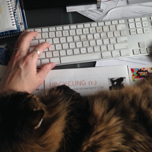
My cellphone sees…
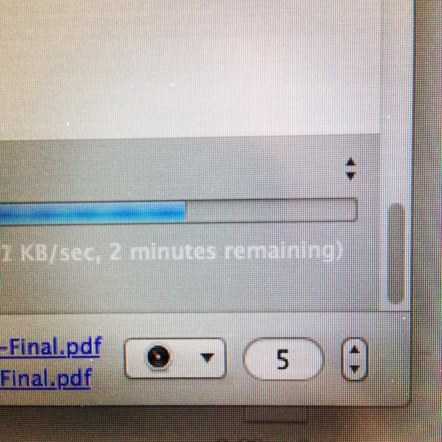
Almost done @t8nmagazine
More from the Archive folder
Here’s one from Hole’s. One Xmas we got one of those tacky sponsorship spots as a contra on one of the local news stations. Voice overs courtesy of the muti-talented Mr. Earl J. Woods.
I have no idea
It was titled Gnome Me. I have no idea why I drew it but I suspect it had something to do with Hole’s.
My cellphone sees…
Seriously. I'm supposed to get work done how?