Category: D’autres
Windy World
It’s said if you want to sail fromMexico back to to BC it’s easier to go to Hawaii and then swing back east. On the face of it this seems ridiculous, but the winds and currents are one of those absolutes we landlubbers often fail to appreciate. The advent of satellite imagery, open data and of course Google have made the resources available online a great way to visual the issues involved.
Visit the site to play with the maps.
It’s easy to see from this, that if one wishes to go north up the Baja Peninsula and the coast of California you will be head into the the wind the whole time. That means motoring the whole way and bashing into the waves. Better, and probably more comfortable, to sail west on a beam reach and then swing back; all you need is to be comfortable with being 1000 miles off shore. No biggee.
And then take a look at the Atlantic: easy to see why Columbus ended up in the Caribbean rather than New York 🙂
More from the Archive folder
Here’s one from Hole’s. One Xmas we got one of those tacky sponsorship spots as a contra on one of the local news stations. Voice overs courtesy of the muti-talented Mr. Earl J. Woods.
I have no idea
It was titled Gnome Me. I have no idea why I drew it but I suspect it had something to do with Hole’s.
Long Time Runnin’
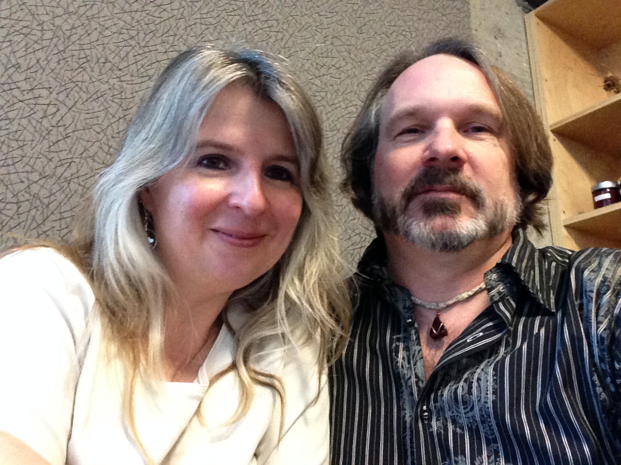
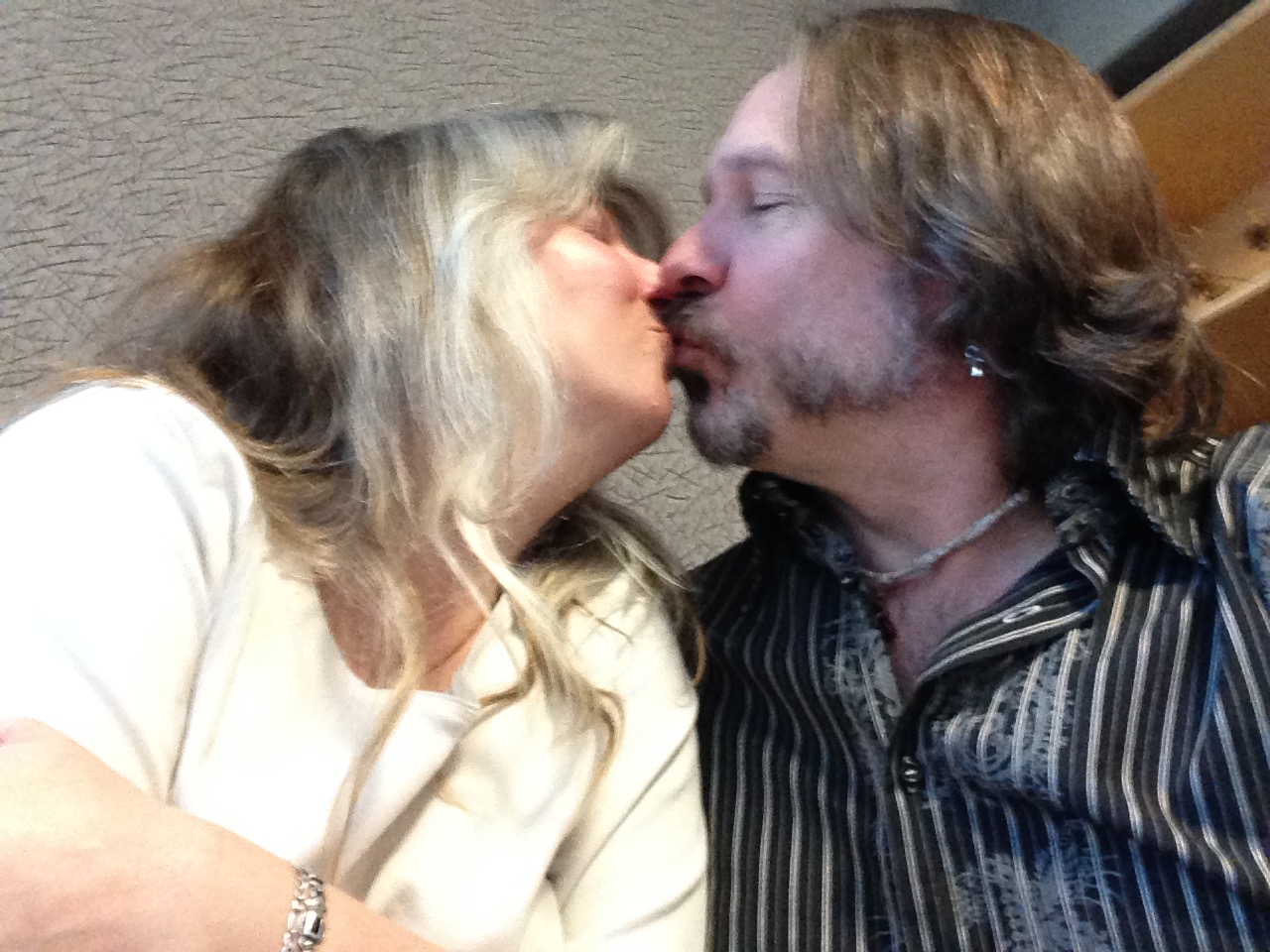
Leslie and I celebrate our “Anniversary” on Valentine’s Day because one of our first official dates was Valentines. Official was kind of a blurry concept, but we are happy with it… Yesterday we went off to Culina’s at the Muttart for brunch and I was informed it has been 25 years. Since math isn’t my strong suit I took her word for it. Here are a couple of selfies to match yesterday’s post (which images were probably ’97 so are actually only 18 or 20 years ago…I told you math wasn’t my strong point.)
Awww…
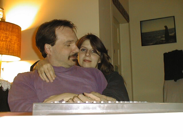
Way back when, I took Hole’s very first digital camera home to do some testing. Here are L and I when we were just babies.
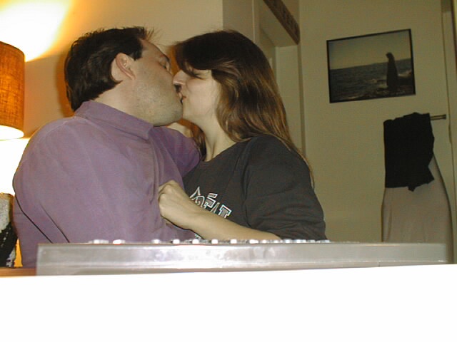
Happy Valentines Day!
More from the archives
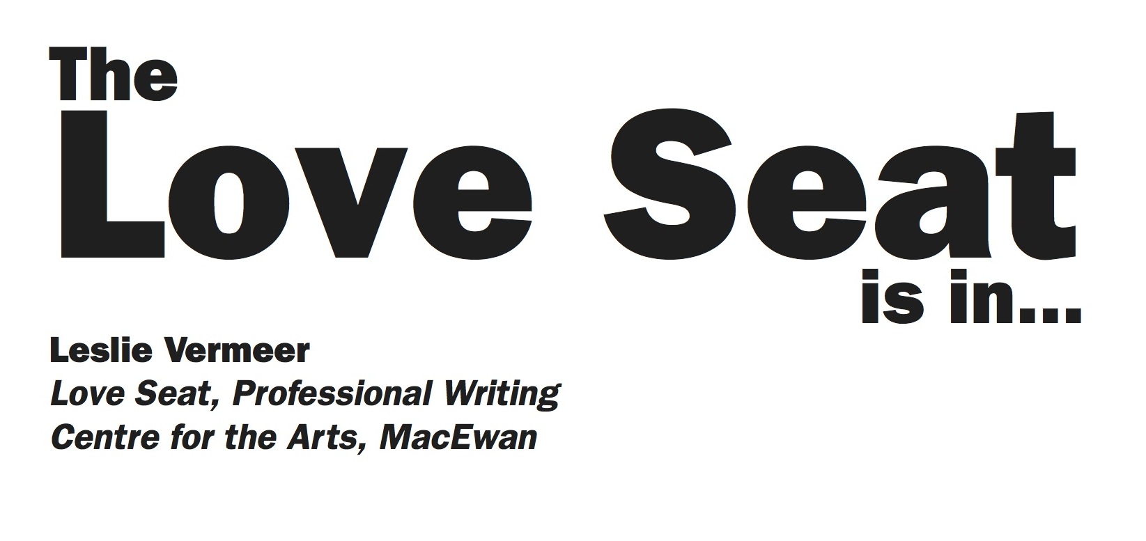
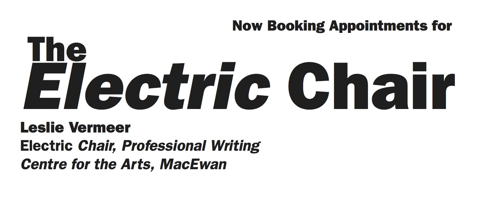
Here’s a couple of signs I made for Leslie upon her appointment to Chair of the PROW Program at MacEwan. I don’t think she ever hung them…
Filler
It’s magazine production week and February is a short month so as a result, the next 6 or 7 days are going to be filler.
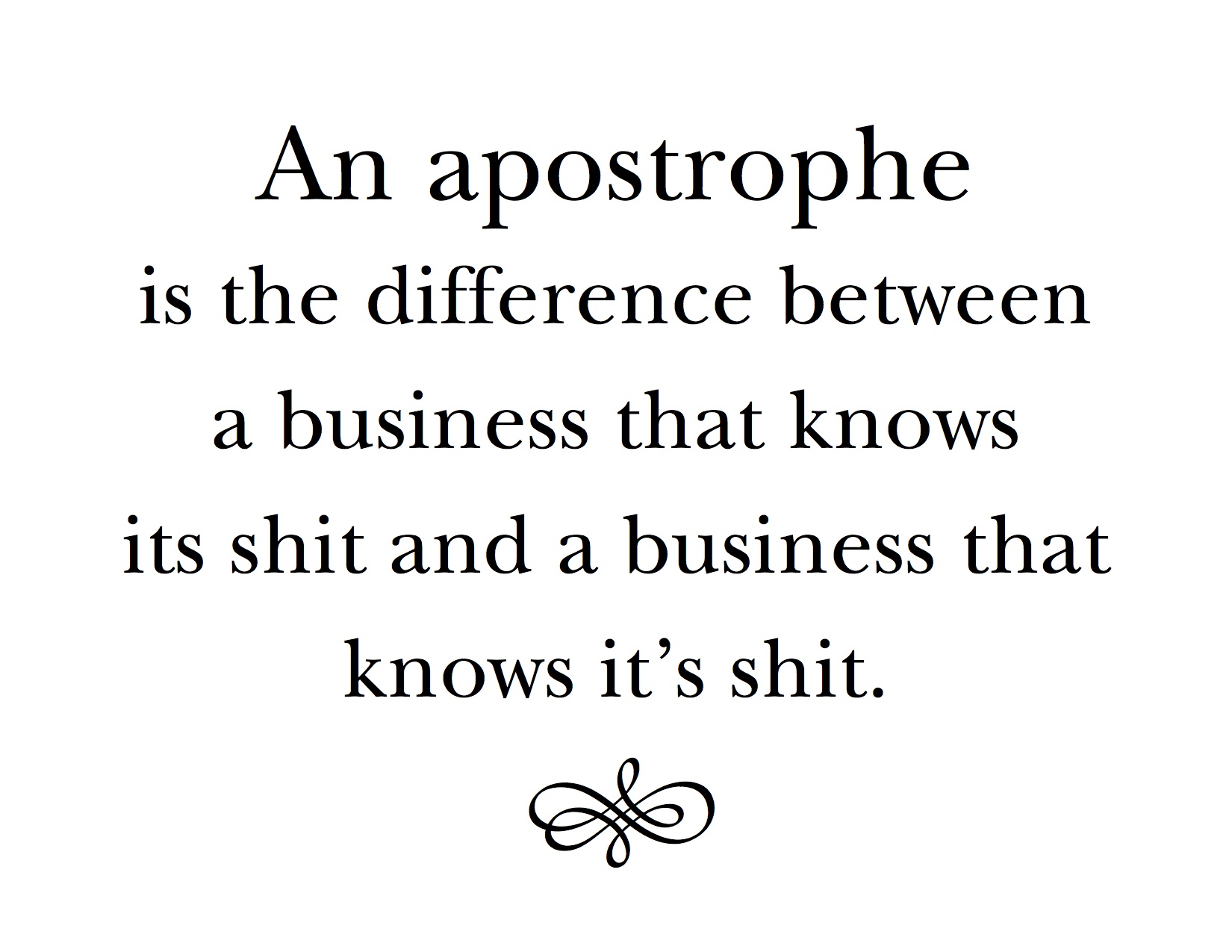
Here’s a sign that used to hang in my old office. I liked it…
Doing it Old School
Duncan posted a link the other day: Hoefnagel’s Guide to Constructing the Letters (ca. 1595). Duncan is a semi-professional letterpress operator and hence has a keen interest in type and typography.
The text on the website reads: “Joris Hoefnagel (1542 – 1600) was a pivotal figure in the history of Dutch art, playing an important role both in the latter stages of the Flemish illumination tradition and the birth of the new genre of still life. In the last decade of his life Hoefnagel was appointed court artist to Holy Roman Emperor Rudolf II, and it was in this time that he appended Georg Bocskay’s Model Book of Calligraphy, of thirty years previous, with his own beautifully exquisite Guide to the Construction of Letters, examples from which are shown below. In each he surrounds the typographic diagram with a colourful array of symbolically charged motifs and, for some, an excerpt from the Bible which begins with the letter of focus.”


The creation of roman typefaces (the first picture) has been ongoing since the late 1400s, (see Wikipedia for more) so these drawings have at least a hundred years of development behind them. Still they are lovely and show the mathematical precision that is the fundamental basis of all type design. The drawings themselves are stunning and art unto themselves, but what they show about the history of a typeface that is instantly recognizable 400 years later blows my mind. There aren’t that many things in our history that can last that long without any recognizable change.
Fonts
Many people call the things we select on our computers fonts but this isn’t technically correct. A font is a specific size and weight of a typeface: 12pt Times Roman Bold. It is so called because in the days of manual typesetting, the typesetter would reach into a big box called a font and select the letters of appropriate size. In the early days of computers (before Adobe developed the first postscript fonts in 1984), computers and printers only came with specific fonts (Times 8, Times 10, Times 12 etc.) so the term stuck when the ability to have infinite variations of a typeface was introduced.


These are images of an old type case we came across in Saarburg, Germany, showing the various fonts of the typeface Federzug-Antiqua. This typeface was developed by A. Auspurg in 1913 in a Frankfurt foundry (the name given to a place that designs and builds type) and, as far as I know, never digitized. You can see how the letters are broken up into compartments, the bigger compartments containing the more common letters like e and s.

The history of type and type design is incredibly fascinating and when you stop and think about it, so much of it influences how we perceive and use books and reading in general. The current arguments and discussions on how typography and its principles are going to transfer to ebooks is a topic I am following with great interest, both for what we stand to lose and what we stand to gain.
Oh yeah, that makes me mad…
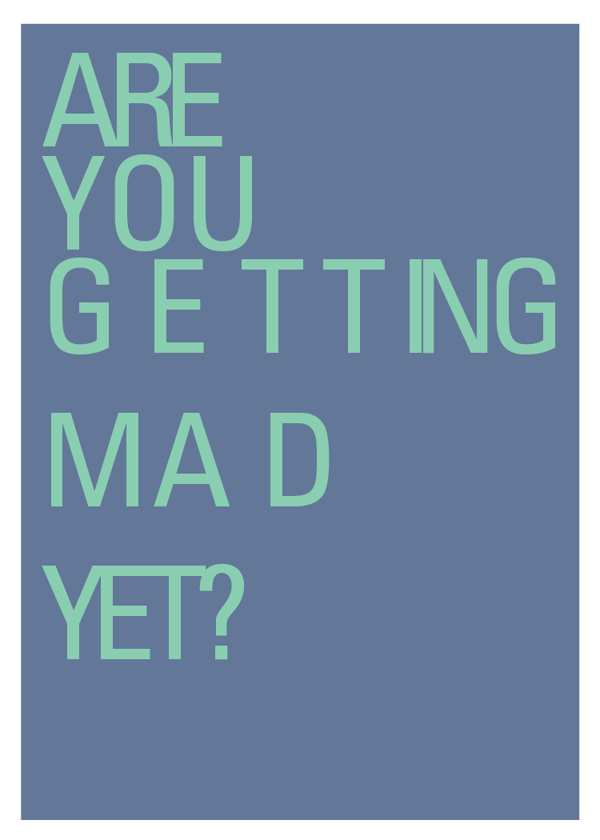
You’d likely have to be in the business to get this one, but trust me, it’s funny. To see more of Sara Heffernen’s visual typography puns visit http://theultralinx.com/2015/01/hilarious-graphic-design-pun-cards.html
Driving around St Albert
Getting the tour of St Albert today, being seen at all the best racks is St Albert’s new media darling T8N magazine!