Vancouver to San Diego Part 1
Forgive the odd image placement. It’s hard to do on the phone.
August 31
7:30 am
53° 16.0117′ N,113° 41.8405′ W
Up at some ridiculous hour and off we go. While it was bone dry at our condo we were surrounded in four sides by lightening. At 6 in the morning it is kind of eerie since your brain isn’t function at full speed yet. By the time we were half way round the Henday (our ring road) the rain had started and we just tried to keep out of the maniacal morning commuters’ way and still stay between the nearly invisible lines.
Still we made good time and arrived at the airport barely 40 minutes after leaving the front door. There was an tender but not so tearful goodbye and L drive off leaving me to my dates for the next few weeks.
For those who don’t already know I am joining my friends Tim and Donna on their Baltic 42 as they begin their journey to Mexico. I am just sailing the Vancouver to San Diego leg and get to miss all the boring stuff in the sunny south.
By the time I got through security and made my way down to gate bazillion-and-one I had barely sat down before they called the pre boarding. Since I had emergency row seats I got to stand right back up and board. We started boarding at 7:10 for an 8 o’clock flight. These things are getting more and more inefficient.
8:30 am
49° 16.2889′ N,123° 8.2490′ W
And hour and a bit later I grabbed my bag at YVR and after a bunch of waffling decided to grab a cab. It took me straight to Granville island with my overly heavy duffle and I waddled down the dock to where I saw Northwest Passage tucked up against a powerboat.
There was no one aboard so I called Tim. They were at Starbucks borrowing wifi so I dumped my gear aboard and headed out. The boat looked like it was still undergoing refitting more than something set to cruise a couple of thousand miles south but then boats always look like that up until the last minute.

After a quick greeting I headed off to visit West Marine while Tim and Donna headed back to the boat. I scoped out some prices and then walked a few more blocks to Steveston Marine chandlers. I picked up an inflatable off with an integrated harness and tried on a few jackets before deciding to buy the WestMarine house brand instead. So back I went and picked up a jacket and a pair of cruising boots (fancy sailing gumboots) and then hauled my loot back to the boat.
1 pm
The rest of the day was spent doing odds and ends. We installed a 110 plug in the vberth and a twin 12v/usb plug at the chart table. These were fairly simple jobs but involved a lot of boat yoga so I was a tad stiff later.
Next up was bolting deck rails on the stanchions for lashing spare tanks we have 1 gas tank, 4 diesel tanks and 4 water tanks, all 5 gallons each. Along the way I managed to drop Tim’s favourite crescent wrench overboard. Losing other people’s tools seems to be becoming a habit for me.
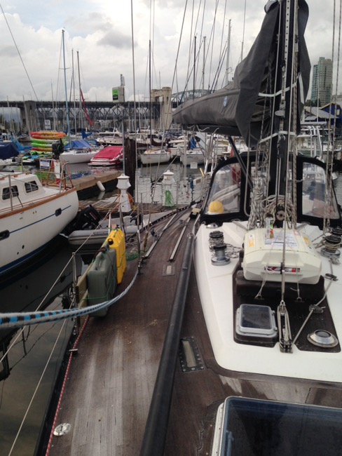
Once those were done we then worked on a grab rail for the dodger. this involved wonderful the docks trying to find something we could bend this 3-foot piece of stainless steel over so it would match the existing curve. Pretty much every system we came up with was almost guaranteed to kink the thing rather than add a bend but like the manly men we are we persevered. Well actually Tim persevered. I eventually got bored and wandered off after declaring the task impossible. Of course now we have a handy, perfectly curved, stainless steel grab rail attached to the front of the dodger so I guess we all know who won and crushed in that scenario.
Supper was a late night bbq’d steak and that was pretty much it for Day 1. I crawled into my berth and resolved to actually get organized later.
September 1
8:00 am departure
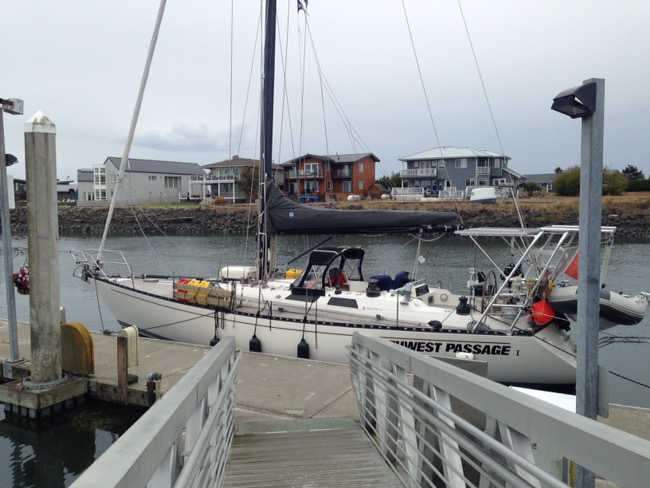
I wandered up to the shore to have a lovely hot 6 minute shower and was back on board and ready to go by 8. We were supposed to meet up with our traveling companion Sea Esta X out in English Bay by 8:30. Sea Esta is Tim’s boat, a Catalina 42, and he is also taking it south. His crew was joining us in Point Roberts where we would clear into the U.S.

The winds were South 10-15 knots so of course we were going south. We did roll out the jib and actually had a good sail with the winds climbing over 20 knots at one point. One long tack took us out towards Sandheads.
10:47
49° 7.1764′ N,123° 19.0649′ W
We spotted some dolphins around out among all the fishing boats at the mouth of the Fraser River.
A bit later we tacked to get closer to shore but right around Tsawwassen we gave up, rolled in the sail and motored the rest of the way.
1:57
Point Roberts
48° 58.5899′ N,123° 3.8183′ W
2 hours plus at customs. I’m not sure what kind of bureaucratic hell the CPB officers dwell in but it has to be some sort of punishment. There were multiple, multiple phone calls, visits from at least two different pairs of officers, more phone calls and contradictory instructions. But the only question they asked was what was my job which they decided was irrelevant since I was just heading home right away.
Eventually they did issue us our cruising license although they had to phone us the actual clearance number since their system kept crashing and we were free to cast off.
4:06 departure
In the long interim the winds had turned to light so we motored against the current towards Sucia Island. Intermittent dolphins visited along the way and we had a pleasant trip across the bottom of the Strait of Georgia.
6:56
48° 45.679′ N, 122° 54.951′ W
Sucia Island
After we pulled into Shallow Bay on the north side of Sucia I brought us alongside and we rafted to Sea Esta X rather than dropping our own hook. The Catalina is rather luxuriously appointed so we abandoned ship in favour of a cold beer under their canvas.

An hour or so later dinner on deck was corn and pollock burgers and then it was time to hit the sack.
Logo Design for Dummies
This is a short article I wrote for August issue of T8N magazine on 8 tips for good logo design. Nothing earth shattering and written to fit into their 8s section.
###
A Logo Is Worth a Thousand Words
Every good logo tells a story. In fact, your logo is often the first introduction that potential customers have to your business and, therefore, needs to be able to stand on its own as your front-line brand ambassador. Tall order? A little, but with more and more customers wanting to feel a connection to the brands they support, the role of your logo as a brand ambassador becomes increasingly important. So what makes a logo a good logo? And just how does it tell your story? Here are 8 tips to consider…
Always Consider This
If in doubt, leave it out. If you can’t rationalize something in your logo, chances are it should be removed. When your logo is at its simplest, it’s probably at its strongest. Be ruthless.
1. Ask the Whys
Why do you have a logo? Who does it target? What is its purpose? If you can answer these deceptively easy questions, you are well on your way to creating a great logo. Time spent figuring this out is probably the single most valuable thing you can do when considering logo design. And don’t forget: since every good logo tells a story, yours should be filled with meaning (both obvious and hidden) and even occasionally whimsical—did you know the Apple logo has a “byte” missing?
![]()
2. Keep It Simple
Name the first three logos that pop into your mind, and chances are they are clear and uncomplicated (at least on the surface). Simple but powerful logos almost always prove the best at standing the test of time. Trust in that.
3. Logotype vs. Logomark
People often confuse a logomark (think Nike’s swoosh) with a logotype, which uses the name of the brand rather than a symbol or icon (think Google or Disney).
A logotype is often the easiest and most all-around logo to use since it identifies the name of the company or product, as well as expresses the brand. But it is also often bulkier and is sometimes more difficult to use in situations where something smaller and simpler would work better.
A logomark can help enhance brand identity. This is especially true if your mark happens to be a representation of your product or service. And if a logomark is marketed correctly, it can often be more identifiable than a logotype, as exemplified by the Apple or Lululemon logos.
![]()
4. Shape, Proportion & Symmetry
Where does your logo need to appear? If you do a lot of sponsorships, the logo will often appear at the bottom of a sign or poster, along with a lot of other logos. Do you have (or want) a strong web presence? Will your advertising strategy involve TV? How about print? The shape and proportion of your logo may affect how it fits in different applications or media, so try out the basic shape in as many situations as possible.
A symmetrical logo is aesthetically pleasing and will encourage more symmetry in whatever application it’s used in. Asymmetry can carry a complexity that communicates different emotions—anything from laid-back to intense or moody. There is no right answer, but take a moment to carefully consider the implications.
5. Colour & Tone
Make no mistake, your colour choice will communicate ideas. Lego’s red, for example, reflects passion and energy, Starbucks green speaks to nature and freshness and Intel’s blue conveys professionalism and sincerity. Consider your message before committing to a colour choice.
Remember, too, that for a logo to be really useful, it needs to work in black and white or even in reverse (as white on a dark background). So colour should be the last decision you make.
![]()
6. Active vs. Passive
Consider your business and consider your brand. Should your logo convey a sense of movement and activity? Red Bull’s charging bull and Twitter’s flying bird are both instilled with motion and energy, which complements their brands. What do you want your potential customers to feel?
7. Negative Space
Don’t forget that the shapes in your logo can often convey more than one image. The right facing arrow embedded in the FedEx logo is the classic example of using negative space to add meaning. But also consider the simplicity of the white peacock in NBC’s rainbow of tail feathers or the clever “1” in the Formula 1 logo. Used correctly, negative space can allow you to add more elements to the design without increasing the complexity.
![]()
8. Consider Custom Type
When it comes to good logo design, a typeface should be unique. A custom, hand-drawn typeface is always better than something standard or that you download off the Internet—just take a look at the timelessness of Coca-Cola. A custom type helps ensure that your unique logo will stay that way. But if you can’t afford a completely custom font, at least customize any pre-existing font to make it your own.?
###
8 Biggest Logo Mistakes
- Overdoing the special effects. More is not better.
- Using too many fonts. Use one or two at most.
- Not considering its scalability. Does it work as well tiny as it does on
a billboard? - Being too trendy. Don’t just jump aboard the bandwagon—stand out!
- Being too abstract. Don’t leave your customers guessing.
- Leaving it to an amateur. Cousin Bob may be cheap, but you inevitably get what you pay for.
- Relying on stock art. It’s the quickest way to look like everyone else.
- Relying on colour to be effective. All too often, colour is a luxury you can’t afford.
Did You Know?
 Since the time of Euclid, people have studied and used the golden ratio, which in mathematics, is when the ratio of two quantities is the same as the ratio of their sum to the larger of the two quantities. Good logo design often makes use of such classic principles. Despite the fact that the bite out of the Apple logo seems to violate the symmetry of the logo, if you break it down, you can see that they put a lot of work into applying math to the design.
Note: many people think the strict adherence to the Golden Ratio in the Apple logo is a bit of a myth but I think the use of proportion and symmetry still shine through regardless of the precise math.
Instagram This Week


Instagram This Week


Instagram This Week


Heading Down the Coast
No, we are not taking Never for Ever out into the pacific (yet). But yes, I am heading south aboard a friend’s boat.

Ever since we managed to basically motor around Vancouver Island, I have been hankering to get back out “offshore” to see if it is something I actually want to do on my own. Well Northwest Passage, the Baltic 42 we did our circumnavigation on, is heading south next month to Zihuatanejo for a few years and they were looking for a hand for the “crappy”part down the west coast of the U.S. before they join up with the Baha Haha in San Diego. After a lot of humming and hawing I finally decided that — YOLO being the philosophy de jour — I might as well take advantage of the opportunity.

There are generally two options once you turn south after exiting the Strait of Juan de Fuca. One is to head offshore 20 miles or so and head strait to San Francisco. This is the most generally popular option because many of the ports available on the rugged Oregon coast are subject to weather and feature some of the roughest weather around — some say in the world. This means sailing 10-14 days straight. The other option, obviously, is to try and harbour hop down and sleep in a harbour most nights, hoping the weather allows getting in close to shore. At this point we are going to be trying for option 2, but I assume that option 1 is always available if the weather doesn’t cooperate.

After we leave San Francisco, which should be around 2 weeks after leaving Vancouver, we set sail again and make our way to San Diego which is another week away. That leg of the trip offers a lot more options for places to stop. So in a perfect world the trip should take around 3 weeks, with lots of hard sailing and tons of experience for me.
The tentative cast off date is September 1st, weather depending. I will likely fly out the day before and pick up a few personal provisions before board the boat. I haven’t yet decided if I will blog the whole trip or just post a summary when it’s all done. I guess that will be decided by just how much of interest actually happens.
—Captain Why #Posts
Instagram This Week


Instagram This Week


Instagram This Week


2016 Route Roundup
I am once again amalgamating all my tracks (see the 2015 version) from our cruise using Google’s My Maps feature. I still had to email all the tracks to myself from the Navionics app on my iPad and then download each KMZ file to my desktop. Next I uploaded each file to a separate folder in Google Earth and combined and edited the layers into a few folders to get around My Maps’ 10-layer limitation. This will allow me to import the finished KMZs straight into My Maps. As I wasn’t as conscientious as usual about starting and stopping the tracks, I had to go in and edit a lot of them in Google Earth. As always I am still looking for a better way…
 The Trip
We left Victoria on May 5th and tied up for the last time in Nanaimo on June 19th. We only got as far north as Von Donop Inlet but did manage to make it to Princess Louisa finally. As you will see below other than finally spotting the elusive BC Turkey vulture there was a total dearth of large wildlife.
Click here for a link to an online version.
Here are a few stats
46 days in total
24 travel days
227.6 km (421.6 nm)
Longest day: 74.5 km (40.3 nm)
Highest winds: 21 knots
Nights at a marina: 8
Nights at a public dock: 9 (no power or water)
Nights at anchor: 26
Orca spottings: 0
Humpback spottings: 0
Dolphin/porpoise spottings: 0
Bear spottings: 0
Total Stats for the Year
June 2015–June 2016
335 days living aboard
118 days cruising
1747 km (943.5 nm)
Pictures taken: 2329… anyone want to come over for a slideshow?
—Captain Why #Liveaboard, #Posts