Demonbane

The demon’s ichor dripping from his shattered breastplate, the massive warrior raised his fist to the sky and screamed. “My thanks Oh Oydin for this final victory. Our foes lay shattered at your feet, and we, Are, VICTORIOUS!” Torn and bleeding from scores of wounds, the warrior dropped his massive and broken shield beside the monstrous demon’s crushed skull and stared at the remains of the incinerated mace. He sketched a bow to the now useless weapon and then turned to face the blackened altar.
“After all these years and too many deaths, at last…” Leather creaking and armour groaning he dropped to his knees and bowed his mighty head in supplication. For a moment then he rested his head and remembered the path. The journey of sorrows and tragedies that would now live on only in song.
Then he surged to his feet and strode purposely up the basalt stairs and the pains and sorrows of battles present and past fell away as he stood straight and proud before the sword that lay wrapped in the perfect folds of stone. As he laid his hands upon the sharkskin hilt twined with threads of pegasus mane and decorated with a single massive blue stone, he once again tilted is head back and spoke to the sky.
“I come to claim my birthright. I have survived the trials and defeated your enemies and, as it was foretold, it is time for peace in the land. With this the sword of Oydinright, I and my sons will rule in your name and no more shall Loski’s minions trouble our people. It is done.”
And with that he heaved mightily on the sword to draw forth the ancient symbol of a god’s love and approval and bring it once more into the land.
“Oh crap.”
Happy Birthday
Happy birthday to you,
Happy birthday to you,
Happy birthday, happy birthday,
Happy birthday to you,
And many morrree…!
Sung to the tune of Happy Birthday©
It said to do what?

“Cryste, that hurt. Ok, I got it. What next?”
The slender young man holding the book looked down at the screen and read “Turn the main flange tightening unit clockwise until it hits the safety stopper. Hey Boss, what’s clockwise?”
Kavin was still rubbing his elbow where he’d smashed it into the outer casing, but he glanced up at his apprentice who was hanging off the main strut on his harness, dangling there like a gawky primate. “Don’t rightly know. I mean, turning clockwise is a turn to anti-sinster—you should know that kid—but what a clockwise actually is, well that’s beyond me.”
“How come? I mean don’t they teach ya stuff like that when you become a Master?”
“Look kid. I can strip a modern generator unit down to nothing and rebuild it with my eyes closed, but this ancient shit is beyond anyone. They ain’t taught this stuff in hundreds of years. And who the hell cares why they couldn’t speak proper back then; that’s why books have dictionaries and translate functions.
Now read me the next bit and make sure you got the tools ready. I’m tired of this shit and my wings are about to fall off.”
Doing it Old School
Duncan posted a link the other day: Hoefnagel’s Guide to Constructing the Letters (ca. 1595). Duncan is a semi-professional letterpress operator and hence has a keen interest in type and typography.
The text on the website reads: “Joris Hoefnagel (1542 – 1600) was a pivotal figure in the history of Dutch art, playing an important role both in the latter stages of the Flemish illumination tradition and the birth of the new genre of still life. In the last decade of his life Hoefnagel was appointed court artist to Holy Roman Emperor Rudolf II, and it was in this time that he appended Georg Bocskay’s Model Book of Calligraphy, of thirty years previous, with his own beautifully exquisite Guide to the Construction of Letters, examples from which are shown below. In each he surrounds the typographic diagram with a colourful array of symbolically charged motifs and, for some, an excerpt from the Bible which begins with the letter of focus.”


The creation of roman typefaces (the first picture) has been ongoing since the late 1400s, (see Wikipedia for more) so these drawings have at least a hundred years of development behind them. Still they are lovely and show the mathematical precision that is the fundamental basis of all type design. The drawings themselves are stunning and art unto themselves, but what they show about the history of a typeface that is instantly recognizable 400 years later blows my mind. There aren’t that many things in our history that can last that long without any recognizable change.
Fonts
Many people call the things we select on our computers fonts but this isn’t technically correct. A font is a specific size and weight of a typeface: 12pt Times Roman Bold. It is so called because in the days of manual typesetting, the typesetter would reach into a big box called a font and select the letters of appropriate size. In the early days of computers (before Adobe developed the first postscript fonts in 1984), computers and printers only came with specific fonts (Times 8, Times 10, Times 12 etc.) so the term stuck when the ability to have infinite variations of a typeface was introduced.


These are images of an old type case we came across in Saarburg, Germany, showing the various fonts of the typeface Federzug-Antiqua. This typeface was developed by A. Auspurg in 1913 in a Frankfurt foundry (the name given to a place that designs and builds type) and, as far as I know, never digitized. You can see how the letters are broken up into compartments, the bigger compartments containing the more common letters like e and s.

The history of type and type design is incredibly fascinating and when you stop and think about it, so much of it influences how we perceive and use books and reading in general. The current arguments and discussions on how typography and its principles are going to transfer to ebooks is a topic I am following with great interest, both for what we stand to lose and what we stand to gain.
Big Dog
I never wanted to teach him to drive. It’s not easy, driving, and I think people should learn the good habits before they learn the bad. But I learned on the job and the world’s a different place now.
Funny expression that. Especially in this context. Huh.
“Are you belted in?”
“Yes Dad.” It was in that tone that billions of parents have heard and learned to loath. When did I become such a non-entity. Who’s teaching who here boychik? You gotta few million miles to put on before that tone is justified. Come talk to me then.
Of course I’ll be old and senile when that happens and it won’t occur to him to treat his senile, dried up old husk of a father any other way. So he’ll be polite. Solicitous even. Respect through pity… that’s all I get.
“Make sure you have the seat adjust properly. It’s safer and a lot more comfortable. Trust me.”
“I did Dad.” What happened to that laughing baby? That smiling boy that lit up a room? God, you were a charmer; everyone said so. I hope I’m there when you get it back. I hope it’s not gone from our lives quite yet.
I take a deep breath and double check everything. Letting go is hard.
“Ok. Looks good. I guess I’m ready when you are.”
He looks over at me quickly, not quite willing to meet my eyes, no attempt at reassurance. Just a quick glance to make sure I am not going to change my mind. No doubt in his mind. It’s my fear that’s holding him back; preventing him from growing into the man he already thinks he is. My fear. My understanding of statistics and probabilities. My years of observing and avoiding accidents and my knowledge of the horrific fates of so many, less-fortunate, others who’s ashes are now scattered to the winds.
Suck it up. Be a man. Let go the leash and allow the hounds of fate loose to fly…
He reaches forward with his left hand and disengages the brakes: the safeties; and then he rests his head into the cradle of the high tech headrest. A quick, studied flick of his right hand starts engine and with a second flick I feel my entire body pressing back into the seat.
No turning back now.
I look over at him and I see it. Just a hint at the edges of his eyes. That smile.
I grab the RAM and key the mic. “Moon Control, Moon Control, Moon Control, this is Orbital Launch Laughing Baby. We are out bound heading 240° darkward for a training flight. Estimated return one hour thirty.”
That moment
T his is a new feature, called Shorts inspired by a blog on Tumblr where a fellow wrote short SF stories everyday. Called 30 Second Sci Fi, it was tremendously successful and a great learning experience for him and he made a book out of it. I thought I would give something similar a try, and hopefully it will be more readable than Edward’s tale. And I made a cool (but cheesy) logo, so that guarantees the stories will be good!
Edward looked across the table at her. His eye were glossing over so she could tell she was already losing him.
“Never mind.”
“What? No, no I’m listening. He was using the balloons to tell a story… I get it..”
“No you don’t. I can’t believe I bothered. You are so rude. You are a moron. You hate me. Just go, vamoose. Stay. Why don’t you get it? Can’t you try? A little harder? God, am I that complex? It’s so bloody simple, my stupid iguana gets it; I can’t believe I am wasting my life trying to discuss these things with someone with a brain the size of a walnut.
Stupid rabbit.
Stupid me.”
The stupid look on your stupid face. It’s so worth it.
“That’s right Ed. Balloons. But since there actually weren’t any balloons right? And it wasn’t a story. You can see that…right?”
Hmmmm, I think I need to paint that wall again…
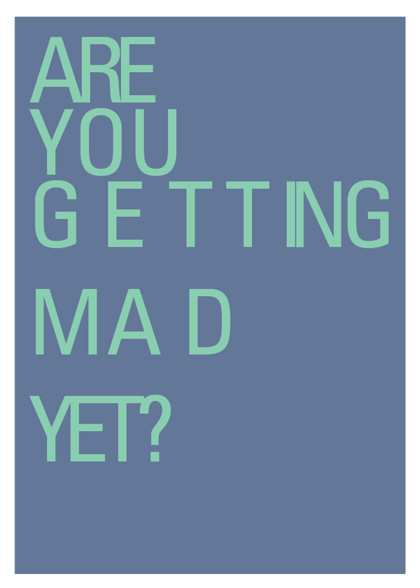
Oh yeah, that makes me mad…
You’d likely have to be in the business to get this one, but trust me, it’s funny. To see more of Sara Heffernen’s visual typography puns visit http://theultralinx.com/2015/01/hilarious-graphic-design-pun-cards.html
I Fold…

The big cheese had some specific ideas on what she wanted for graphics on this article but we still couldn’t find the hook. Hell we still couldn’t nail the title. And her initial ideas were a bit beyond our photographic or photoshop skills. So I started playing with ideas of folding boundaries and was reminded of those old Mad Magazine folding covers where you folded the image to reveal a hidden image. A few quick tutorials and some down and dirty photoshopping later and I sent her this:

Unfortunately the concept didn’t shine through, I doubted my ability to get it where it needed to be and the whole thing went over like a lead balloon. Still, I kept browsing the templates on DollarPhotoClub.com and muttering to myself. Eventually I found a folded piece of paper on a different angle and remembered the aerials that Brenda and I had taken last year on our little helicopter ride around the city. Maybe there was something of S. Albert and region there…
Nope. But there was this one of south Edmonton which was close enough in my books.


So now all I had to do was fold the image into the shape of my paper template, add highlight and shadows and I would be golden. Photoshop now has this awesome tool called Perspective Warp. Essentially you can just lay out a grid (or series of grids in this case) and then use the grid points to reshape the image as necessary. I used the folded image I had downloaded as my base for getting the right geometry and perspective.

Then it was a matter of studying the light and determining how to add highlights. At this point I deviated from the template and decided to go for a highlight in the center panel rather than a shadow. So I traced the outline of that panel with the Polygonal Lasso Tool, then made a new layer and filled the selection with white. Then I dropped the layer transparency down until I got the feel I wanted (it was around 17%). This had the added benefit of creating the illusion of actual folds.


At this point I turned off the bottom template layer. and added a new layer below everything. Once again I traced out a square shape with the Lasso and this time I filled it with black. Then I applied a pretty big Gaussian Blur (a standard Photoshop filter) to the layer, trying a whole bunch of settings until I got the effect I wanted.

Then it was simply a matter of turning back on all the appropriate layers and seeing what I had. The black shadow was way too prominent, giving the whole thing a hokey feel so I kept dropping the transparency on that layer until it felt a lot more subtle: around 41%. And that was that. The image got turned a bit in the final layout but since it was the only object on the page the light and shadow would work at pretty much any angle. By crossing the gutter with the image and overlaying type on parts of the it the whole spread gained dimensionality. A pull quote was used to balance the image and the spread was done.
Oh and somewhere in there I pitched the idea as the landscape being flexible, and the final title was also settled. A good days work.

My cellphone sees…
Is this what working for a living is like?

Fonts and Hidden Files
The current Adobe Creative Cloud suite comes with a ton of fonts. While researching the easiest/cheapest way to get a selection of fonts to use in projects and ad designs (other than the time honoured tradition of stealing them), I realized that if I am already paying for Creative Cloud then the 100+ fonts they offer in TypeKit for both print and web design were probably enough.
The issue comes when you realize that the fonts disappear when the subscription ends and, while the theory is that I have to be paying for InDesign to open old projects anyway, not being able to archive the fonts makes me nervous. And it occurred to me for a computer to be able to use the fonts they had to actually be on my computer somewhere…didn’t they? So I went looking for a solution and lo & behold I came across dylanvalade.com/post/74649521957/how-to-find-synced-typekit-fonts-on-your-computer.
Essentially the solution is to go to Macintosh HD/Users/YOURNAME/Library/Application Support/Adobe/CoreSync/plugins/livetype/.r/ and your fonts will be in this .r folder named FONTID.otf. Of course this is a hidden directory so for OSX 10.8 Mountain Lion (contrary to Dylan’s instructions) you must go to Terminal and type in:
defaults write com.apple.finder AppleShowAllFiles TRUE && killall Finder
To later make them all invisible again use:
defaults write com.apple.finder AppleShowAllFiles FALSE && killall Finder
Then it’s the long process he describes to move and rename all the files. Finder won’t let you change the folder or file names prefixed with a dot like a normal file. So after you copy the .r folder to a safe place on your computer, right click the copy of .r and select Get Info. Change the copied .r folder name to something else by expanding the Filename & Extension option. Then use Get Info to rename each font you need to save offline. The name of the font can be copied (using cmd-C) from the Get Info window just above the Name & Extension box.
Simple…sort of.
Addendum
Once you find the invisible files (cmd+shft+.) you can use some thing like transtype to convert them and that renames them and makes them visible.